Our Blog
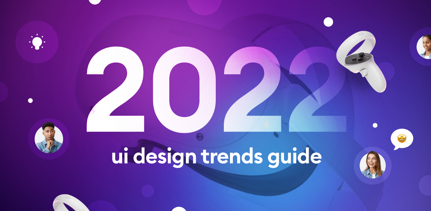
UI Styles 2022 that user will love.
1.Unique Branding with illustration
Custom illustrations 2D or 3D may be Hand made or Digital . Hand free illustration & customized one not only help your platform to be unique or Out of box but it create sociable & fascinating surrounding to make better user experience . With help of motions illustrations come to life make page to stand out . It easily captures user attention & easily understandable to user what company do at a very first glance . Unique illustrations make your platform memorable .
2.Custom cursor interactions--
To stand out your platform more just apply micro animation & flashy over interactions.We've seen all engaging & fancy interactions that encourage us to go through the whole website & what it offer , it also increase the conversion rate .one of the most trendy interaction is when clicked by cursor it create fun / unique result. Latest cursor interactions are- Swirl Cursor Effect,Flashlight Cursor Effect,Distort Cursor Effect,Following Cursor Effect,Text Cursor Effect,Spinning Cursor Effect etc . Product designer have many more tools to play with .
3. Use of 3D in ecommerce
Since Last few 3D come to light its gaining friction now .Animated part in logo , illustrations & text are getting developed in web pages , making our platform easily distinguish by users . 3D can be easily implemented into digital product in ecommerce .When creating concepts, designers are able to think outside of the traditional X and Y-axis. We are not locked in the 2D cage anymore. Now, we have more ways to present UI than ever. Let’s make something good out of it!
4.Bolder and more characteristic fonts
Its not that much interesting topic to talk about since most style match particular industry .Fashion apps often have serif fonts ,tech products have sans serif . I hope you understand What i mean . Two things that will influence 2022 UI trend are they have branding of their own & accept bolder fonts . To understand it clearly lets take a example -- Discord and Nike have updated their branding last year it seems they have one thing in common both have thick & bold headings on their pages . From this concept negative space goes off & great impact of titles over page . A bold oversized version of these fonts started appearing on websites, adding more character and charm to the typography.
5.Impact of color palettes
Google rolled out Android 12 and with it the new UI: Material You.Aside from a big redesign, the standout feature for most of us was Dynamic color palettes. An example is Samsung’s One UI 4 which on top of a lot of updates, has dynamic color palettes,having its own android ,it never mean that IOS user will have feature like this in future. UI engineer should keep dynamic color in mind when its about UI .
6. Low code and No-code platforms
This platform has been successful lately . These platform require low amount of programming skills or no code .If you have a bit knowledge of this industry you can build your own website .There are many online editors that allow user to build & launch their own website . Great Designers also used webflow to build their new product Archifolio. Its a personal website builder that makes it easy engineer to build their personal brands & boost their career. Rather than seeing the same template used on several websites, it enables users to build even more unique and creative& Out Of Box pages.
7.Story telling animation
The ability to tell great stories around a digital experience will continue to trend among the best. Typography itself can build a strong visual hierarchy. As an extremely crucial element of UI, it plays a major role in creating an excellent user experience.
8. Designing for foldable
Samsung had a great year in terms of foldable phones. The Z Fold and the Z Flip 3 both sold multiple times more units than their predecessors.Designers need to get used to creating more adaptive screens for foldable devices sooner than later which might be a new frontier for innovation and creativity.


